TikTok Collections
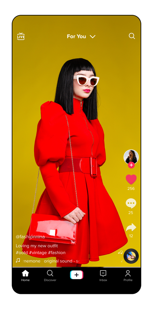
TikTok is a social network that allows users to discover, share, and create short-form videos. From new recipes and makeup tutorials, to trending politics and memes, TikTok offers a wide variety of content that users can enjoy on or off platform.
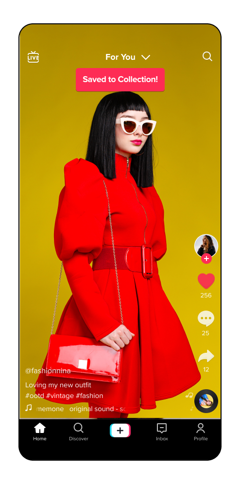
In order to help users more intuitively find, organize, and categorize the content they love, I’ve proposed a new feature: TikTok collections.
Role: UX Designer & Researcher
Design Process
1. The Problem
TikTok allows users to save their favorite content in a variety of ways including downloading it to their camera roll or adding it to their Favorites. However, because these features don’t allow you to properly categorize the saved content, this sometimes leaves users feeling overwhelmed or endlessly scrolling through content in search of videos they’ve previously liked.
2. Research Goals
To begin this project, I set out to better understand how users use this product; how it benefits or impacts their lives; what sets the app apart from its competitors; and how its current features help or hurt the users’ overall experience.
3. Research
I started by analyzing TikTok’s competitive landscape and conducting user research to better understand goals, motivations and frustrations with the product.
Methods used:
Benchmark analysis to contextualize the competitive landscape.
Product analysis to understand the product’s current features.
User survey and App Store review analysis to gain insight into the overall user sentiment.
Benchmark Analysis
User Research
Between 6 participants of varying ages, occupations, and familiarity with the product, here were some of the key insights:
Cons:
Strict content censoring
Algorithm favors certain videos over others
Not enough agency over the content that is served to you
Pros:
General sense of camaraderie and community
Easy to learn about new perspectives and opinions
Educational
Nice way to meet new friends
Fun way to pass the time
When asked “What is your favorite part about TikTok?” one participant answered:
"I like that TikTok has a mix of entertainment and genuinely helpful videos relating to my life. I mostly use it to save or share videos with friends (especially crafting or home decorating vids).
When asked “Have you ever struggled to find a video you've previously liked or saved on TikTok?” this participant responded:
"Yes! I would love a way to categorize my favorites. I “like” TikToks for different reasons (sometimes because they’re funny, sometimes to just to find them again later) and it might be nice to organize them somehow."
Provisional Persona
After conducting all of the research, I consolidated the finding into a fictional persona to use as a reference point as I began designing.
4. Information Architecture
By taking the research and user sentiment into consideration, I created a sitemap highlighting the current features and proposed Collections addition. From there, I created a user flow to show user decision making, and how they may interact with the new feature.
Sitemap
User Flow
5. Design
Once the the general flows were created, I began sketching how the Collections feature may be designed.
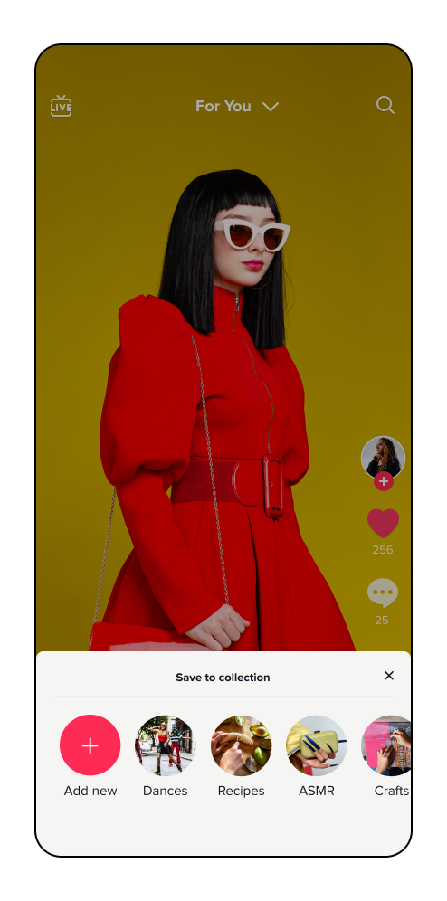
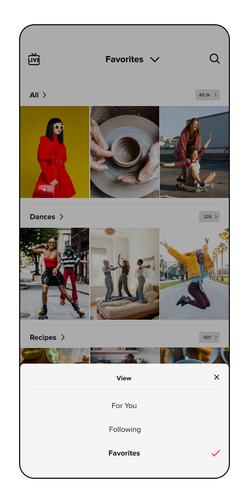
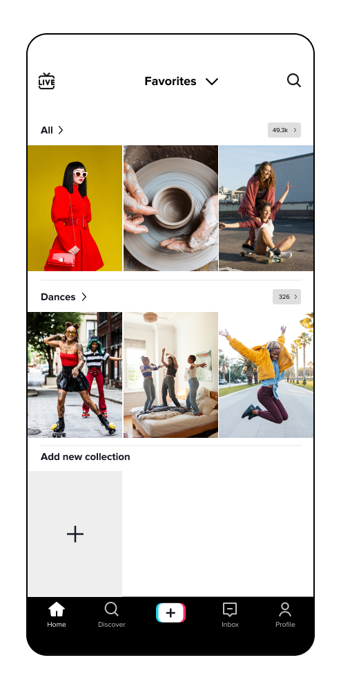
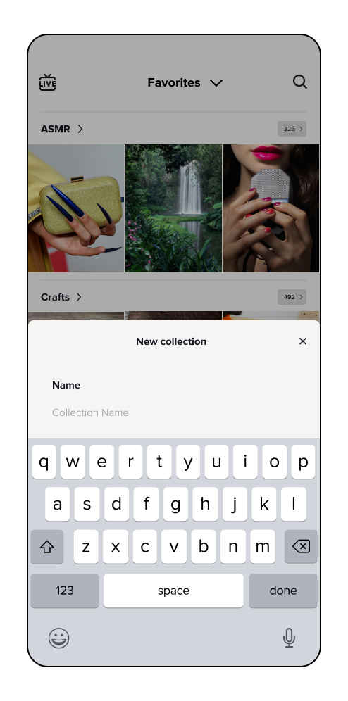
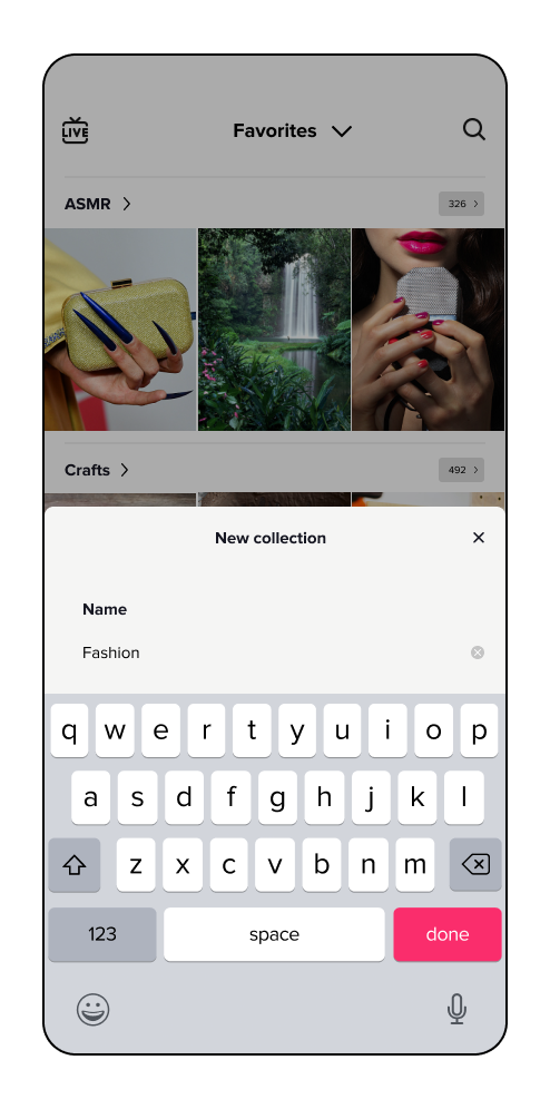
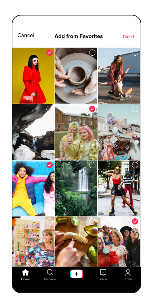
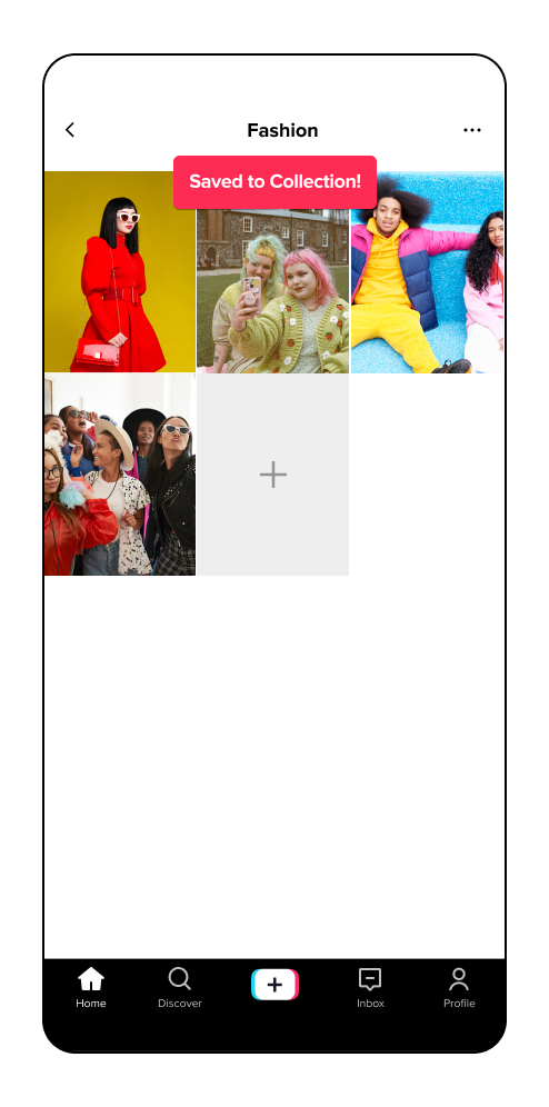
My main goal was to simplify the way users can add and categorize their Favorited videos, so I created a homepage dropdown menu to easily toggle between page navigations, and a quick saving modal to add Favorited videos to a collection.
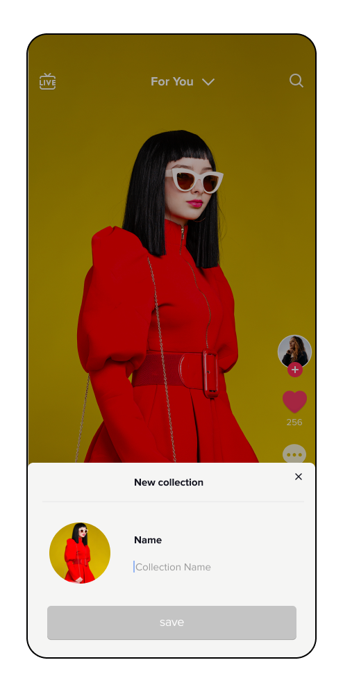
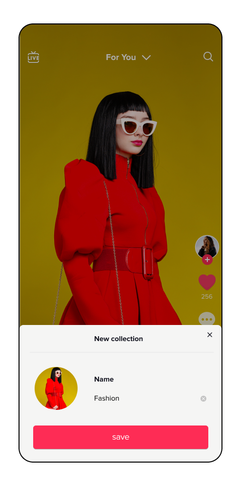
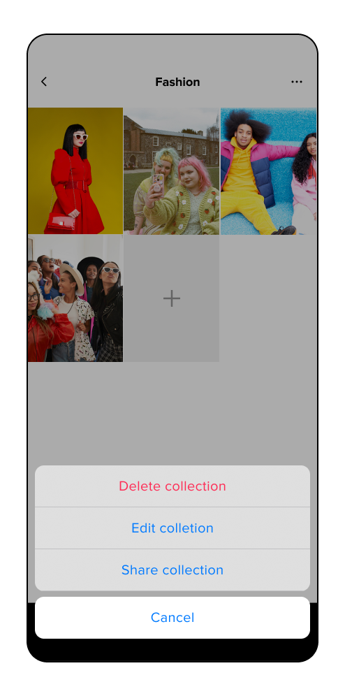
From there, I utilized the products current UI kit to create high-fidelity wireframes and a limited prototype to showcase how this feature could come to life.
Sketches
Wireframes
Prototype
6. Testing
Following the designs, I chose 5 participants to test the initial prototype. My objectives were to observe the overall usability and navigation of the feature, how intuitive the navigation gestures were, the ease at which a user can create a new collection, and any hesitations or difficulty. The participant tasks included:
Task 1: Add a video to a collection from your homepage
Task 2: Create a new collection from the homepage dropdown menu
Task 3: Share the collection you’ve created
Affinity Map
Iterations
One of the main issues I found during the usability test was that users hesitated or struggled to find the Favorites page from the homepage. To solve this issue, I decided to lay out all three page options for more intuitive navigating. This solution would also cause less of a learning curve for users, as this layout is closer to the app’s current UI.
I also observed many participants hesitate to find the “Next” button on the top navigation. In order to be more consistent with the previous confirmation screens, I lowered the button to the bottom and changed the language from “Next” to “Save.”
Another point of confusion was how to create a new collection from the Favorites page. To solve this, I made the creation button more prominent on the page by changing the color and positioning it closer to the top.
Lastly, to keep the actions consistent, I moved the “add” button to the beginning of the collected content for more intuitive page editing.
Conclusion
Adding a feature to an existing product can be tricky for a number of reason. My biggest hurdle with this project was realizing that users maintain a certain amount of muscle memory to complete tasks, and therefore is harder to introduce new features or gestures. However, an intuitive solution to user pain points or hesitations can lead to a successful and useful feature addition.


